Beth, I’m chuffed to see it here, looking so much at home. In case anyone likes explanations, the “Three in One” title refers to my combining circle, square and triangle into one shape, and that effort was in turn motivated by searching for a way to visualise the concept of Trinity.
Needless to say, we were chuffed (love saying that!) to publish this. I’m wondering if anyone thinks it would be better if we identified the media as well as the artist each time we publish artwork? E.g., “Etching by Natalie d”Arbeloff” or “Photo collage by qB”? (For writing, i prefer NOT to say “Poem by x” or “nonfiction by y” – it’s more fun to keep readers guessing!)
This really sticks with the mind’s eye. Wonderful!
Good question, Dave . . I kind of like what the editors are doing now. It’s sort of fun to see which commenter will say, “I like it. Uh, what is it?” And it’s sometimes fun to read the ensuing discussion. But either way . . .
For me, the whole piece rests on the broken border at the bottom and the tiny sun there, nestled in a valley of lines. That it all rests on such a fragile assumption provides a nearly unbearable tension to the steady motion of the lines of geometry above.
Actually, Brenda, the little flower nestling in the valley of lines at the bottom is meant to be the creation that emerges from the three-in-one union above. But I also love the idea that the whole structure is resting on a tiny sun. Once again, something I learn from other eyes.
Qarrtsiluni (2005-2013) was a groundbreaking online literary magazine, one of the first to fully exploit blog software. Though we never quite realized our dream of creating a print-on-demand option for each issue, being online does mean that our back issues remain accessible indefinitely, so there's that. And we published some damn fine stuff — check it out.
Copyright Notice
All copyrights are retained by the original authors and artists. We will gladly forward requests for republication, and would appreciate a link back to qarrtsiluni in return.
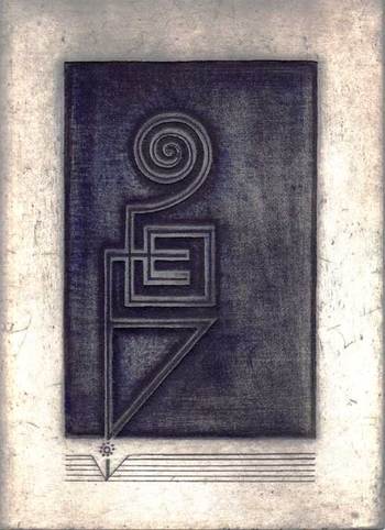

Oh beautiful. Sinuous and musical, yet human made and orderly, all at once.
What zhoen said! Superb.
(o)
Lovely.
Beautiful! Looks like metalwork for a book cover, somewhat in the Art Nouveau fashion. It could be a print.
It is a print, a deeply bitten etching.
Thanks for comments, much appreciated.
It looks wonderful here, Natalie.
Beth, I’m chuffed to see it here, looking so much at home. In case anyone likes explanations, the “Three in One” title refers to my combining circle, square and triangle into one shape, and that effort was in turn motivated by searching for a way to visualise the concept of Trinity.
Needless to say, we were chuffed (love saying that!) to publish this. I’m wondering if anyone thinks it would be better if we identified the media as well as the artist each time we publish artwork? E.g., “Etching by Natalie d”Arbeloff” or “Photo collage by qB”? (For writing, i prefer NOT to say “Poem by x” or “nonfiction by y” – it’s more fun to keep readers guessing!)
This really sticks with the mind’s eye. Wonderful!
Good question, Dave . . I kind of like what the editors are doing now. It’s sort of fun to see which commenter will say, “I like it. Uh, what is it?” And it’s sometimes fun to read the ensuing discussion. But either way . . .
For me, the whole piece rests on the broken border at the bottom and the tiny sun there, nestled in a valley of lines. That it all rests on such a fragile assumption provides a nearly unbearable tension to the steady motion of the lines of geometry above.
Actually, Brenda, the little flower nestling in the valley of lines at the bottom is meant to be the creation that emerges from the three-in-one union above. But I also love the idea that the whole structure is resting on a tiny sun. Once again, something I learn from other eyes.